Pinterest Challenge – Dip Dye Pillow

According to the experts, it is Pinterest Challenge time again!

Yeah, I wrote about my pillow dyeing experiment the other week.   BUT!  Then I saw a tutorial for dying dyeing and pinned it, thinking I would give it another try.  See, I was a little disappointed with the saturation of my pillow.

It looked like this:

When I wanted it to look like this:

My pillow was not bright and bold, it was pale.  And it didn’t have that two tone effect with the dark blue and light blue.

So I found this tutorial just after my pillow-dyeing attempt.  There were 2 big differences here – it says to let your fabric soak in dye for 2-3 hours, where I had just soaked my pillow for 45 minutes.  It also says specifically to use the powder dye, and I had used the liquid dye.  Here’s what the result of the tutorial is supposed to look like:

So I hit up the Hobby Lobby once again, bought the powder dye in teal, same color as before.  Then I dumped the entire package of dye into about 1 gallon of hot water.  This is not per instructions and is way more than you are supposed to use – it is supposed to be one package in 3 gallons of water.  This is my third attempt to dye something and I’d never been satisfied with the saturation, I thought I would go crazy and see what happened if I over-dyed (once before I tried to make a blue tank top black, but it ended up gray).  I added a half cup of salt to the dye too. Oh look, the directions also say to pre-dissolve the powder in 2 cups of water.  Why do they print these directions so tiny?  I did stir it up a bit with a paint stick before dipping my pillowcase in.

I let most of the pillowcase soak in the dye for about an hour.  Then I pulled part of the pillowcase out so only the lowest part was soaking in the dye for another hour.  At the end of 2 hours I rinsed it a bit and then threw the pillowcase in the washing machine because it was taking soooo long to rinse all that dye out.  I’m lazy.

Result:

Nope, I still didn’t get that 2 tone look.  Not even close.  I don’t know why it got blotchy like it did, maybe because I didn’t make more of an effort to fully dissolve the dye powder.  And you would never know that the bottom third soaked an hour longer than the middle third.

It did get the smeary part at the edge.  Like tie dye.  I thought tie dye was cool once.  In 6th grade.

Here it is chilling on the windowseat.  I’m not sure how I feel about it yet – is it better than attempt #1?  Worse?  Or just a different look?

(Hey Susie, if you’re reading this, Ahmed said “that’s a cool pillow”.  So it has received one dude vote.)

DIY Sea Glass Bottles ~ Fail

I’m looking at a craft fail here my friends.  This the tutorial that I re-pinned.

Here are the materials needed according to the tutorial:

  • Blue & Green Food Coloring ( I used the Neon colors from McCormick just because I like how intense the color is)
  • School Glue
  • Dish Liquid
  • Water
  • Paint Brush
  • Glass Jars, Bottles, etc.

And the instructions:

  • Mix the school glue and water as if you were making homemade mod podge.  WHAT?  You don’t know how to make your own mod podge?  So easy!  Just mix 2-3 parts glue to 1 part water.
  • Add a few drops of blue and green food coloring.  Add more blue or green depending on your preference.
  • Add just a little dish liquid.  How much is just a little…well, not too much!
  • Blend well.
  • Now, carefully paint the mixture onto the outside of the glass and let it dry.  Watch out for being too streaky or leaving drips.  Don’t worry, if you mess up – just wash  and start over.

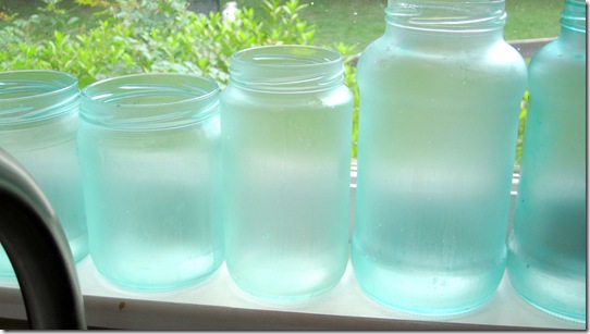
The end result should look like this:

See how they are brightly colored, yet have a frosty finish, but are still translucent?  And you know what she said about not getting streaks or drips?

Yeah, I couldn’t accomplish that.  I bought exactly the same food coloring.  I tried mixing glue and water, making a thick version and a more watery version.  The more watery version definitely dripped everywhere.  But a thick version dripped too, just in slower bigger globs.  I tried a few different brushes, from a tiny one to a sponge one and finally settled on a 2″ brush because that got the job done the fastest and was easiest to coat it without lots of brushing (meaning lots of brushmarks).  I didn’t mix in much dish liquid, just a tiny bit.  I also only used a few drops of food coloring.


From a distance they are ok, and even the photos are alright.  But in real life, up close, they don’t look so hot.  Not hot enough to say, display on a table or a shelf, or put out during a party and say “look what I did”.

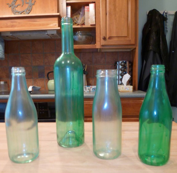
See the drippy mess?  But I was hopeful with a nice, even, opaque coverage on the wine bottle.

I had really good coverage on this one too.

Once they dried, I was underwhelmed.  The blue is so faint that it just looks like regular glass that has that green tint around the edges.  The green is really strong, but up close it is drippy.  And this is a pretty normal color for glass anyway, but it isn’t frosty.

See the drips on the green bottle?

I’ve tried this two more times since with real Mod Podge and more food coloring to try and get the blue to show.  I tried it with and without the dish liquid.  None of those turned out any better, and the brushstroke problem just got worse. So I think I am officially giving up on this one unless someone has a solution.  Sad face.

Dip Dye Pillow

I saw this pillow and thought, how pretty.  Wait, don’t I have some teal dye that I’ve been meaning to use?  And don’t I already have a white pillowcase that could use a little something?

Here’s the inspiration from CapellaKID, an Etsy store specializing in hand-dyed pillows.

I love the effect of the gradient, deeper blue washing over a lighter fade.  Here is another example from the store:

I used an Ikea pillow with removable pillowcase that I bought a couple years ago – mine was a mix of linen and cotton, but the Ritva cushion cover is similar.

I used Rit liquid dye versus the powdered stuff.  I followed the mixture recommended on the bottle for “sink dyeing”, as I couldn’t do the washing machine method if I only want half of my pillow blue.  It was half a bottle for a gallon of water, so about 8 ounces of liquid dye.  It also recommended adding a cup of salt, so I did that too.  The directions said to stir constantly, but I couldn’t really do that while having the pillowcase half resting in the dye.

Overall, I let the pillowcase sit in the bucket for about 45 minutes.  I pushed it further down into the bucket for a while, then pulled it up to just let the bottom soak to try to get that layered effect.  I didn’t stay very precise with it, but occasionally looked to see how it was layering.   After all that I rinsed it a bit and threw it in the washing machine.

The result:

Side A, gradual fade

Side B, more of that wave shape rather than a soft gradient.  Chris said it looked like a stain.  Thanks.

Here is Side A again, but with the dye on the bottom.  I like it best like this.

It is much more subtle, and definitely doesn’t have the level of saturation that I was hoping for.  I might try diluting the dye with less water than recommended and take it for another dip.  When I dip you dip we dip!

Pinterest craft ~ glue painting

My DLF Christie decided we should do a Pinterest craft. You might have seen the pin floating around:

After doing some research (due to pins with no information, hello pet peeve) I tracked this artsy-craft to this blog Virginia & Charlie.  Some commenters mentioned that Elmer’s glue didn’t work, this tutorial linked above used puff paint.  We did use Elmer’s glue, not knowing any better.  In retrospect I did have some globby lines and a different glue would have been easier to control.  Christie and I sketched on canvas and then traced our designs over the sketches.  Don’t mind my blue canvas with white lines, this was a pre-used canvas.  You can definitely see the globs when I did these loops… the glue ran and filled in.

20120209-181400.jpg

Here is Christie’s less globby design:

My mostly completed glue design – before I painted white over it.

And the finished product:

Its not quite perfect due to the globs, I guess I could have wiped it off when it was still wet, but at the time I didn’t have that much foresight.  And where the glue had an air bubble it left a little hole that was impossible to cover with just paint.  Overall I feel moderately happy with my pea-chicken.  I think he would make a good embroidered throw pillow.  Maybe I should learn to embroider.  I did make a pillow in 6th grade at a homeschool convention, and I definitely enjoyed embroidery.  (yes, the one year of my entire life when I was not in public school).

Pinterest Challenge – Faux Mercury Glass

My Pinterest challenge came from this tutorial on faking mercury glass that I found (via Apartment Therapy, who re-posted it) on the blog Take the Side Street by Anna.  Below are 2 of Anna’s photos of her finished product.

I really like the way it looks in the photo above.  All authentic and antiquey.

Here they are all lit up with candles.  They get a bit splotchy, but I know that subtle effects can be tricky to pick up with a camera.

And here is my attempt.

Nailed it!  Ok, not quite.  Her tutorial said to spray the inside of the glass, but I definitely got some drips because its pretty hard to spray at the appropriate 18-24 inch distance in such a narrow space.  I think if I try this again I will stick to doing the outside of the glass to have better control.  Anywho.  When its not illuminated it looks like a fairly flat silver, only lit up can I see the drip marks and the subtle distresses that I added intentionally.

Yeah, hard to get a detailed photo with my point and shoot.  (But that brings me to another goal – use a real camera and not the iPhone camera, see the 2012 page).  So the distressing isn’t nearly as dramatic, but I was wiping away fairly big smudges and I got skeered of wiping too much.  I could keep distressing and then re-spraying, but I was almost out of spray paint.  I may finesse them a bit more when I’m feeling spray-painty.  Do you ever get surprised at how fast you go through a can?

Halloween Decor – Medieval Banner

We had a little theme going on for our first ever Halloween party.  Chris gets excited about the Renaissance Fair every year, so back in the spring he decided that we should have a party with a similar theme.  I decided to make a banner with crests on it – that works, right?

We bought some lightweight white fabric and I cut out squares (rectangles) roughly 8×11, just like a sheet of paper.  I made a shield shape out of paper and “traced” aka painted around the edges of it so that all my shields would be the same size and shape.  I also brainstormed a list of symbols that seemed crest-y to me:  crown, sword, knight helmet, tree, acorn, fleur de lis, horse, lion, castle, tower, etc.  One symbol shown in the photos does not belong at all, but I’ll let you figure out which one that is.  (Hint – its nerdy)

We painted them with normal everyday acrylic paint.  I bought a long roll of jute string at the Lowe’s Depot for a rustic look.  I folded the top part of the fabric over the string and then hot glued the back so the fabric was permanently stuck to itself.  The glue showed through a bit when it dried if the globs were too big.  I could have sewed them, but I don’t have a sewing machine.  Yet.

We painted these freehand, but the fabric was definitely thin enough to trace a pattern through.  Definitely learned that good brushes make this so much easier.  I tried sharpie at first, but that bled way too much, paint was the better choice.

How does one dress up for a medieval / renaissance theme?  Like this.  Yes, there was archery.  We might have put some holes in our shed accidentally.

Island in the Sun

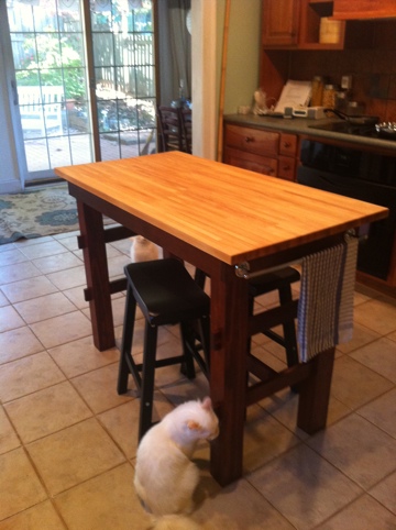
My kitchen island arrived!  And in time for our party Sunday.

20111026-161217.jpg

After a lot of hunting around on the interwebs for the right counterheight table, I finally thought that it would be cheaper and better to just make our own.  I liked the idea of a butcherblock table.  I wanted it to be the same height as our counters to function as additional workspace, and so that it felt like it belonged.  It also needed to be long and rectangular (like the kitchen) so that we could still move around.  Funny how putting a table in the middle always made our kitchen feel small and awkward, when really its not either of those things.  And it needed to have stools to slide under it to make for hang-out space and a place to eat.  We never eat in our kitchen.  The slide-under was important because I didn’t want to be tripping over the stools all the time.

Here’s an example of the close but not quite right – the Groland kitchen island.

What is the point of paying $200 and then not even using the bottom storage?  We’ve got lots of cabinets, so storage is not an issue.  And it would be in the way of my stools.  And cats would be walking all over whatever I put there.  I did get the idea of having a bar for towels from this guy though.

20111026-161242.jpg

Oh and the two saddle stools – also Ikea.  We bought those a while ago having faith that if we bought the chairs, the table would come.  They don’t seem to sell them anymore though, I can’t find them on the website. Bummer.

Before we didn’t have anywhere to hang dishtowels.  Voila!  The bar is tucked right under the edge so it doesn’t stick out.

20111026-161319.jpg

I got the top at (wait for it) Ikea.  The dimensions of 1 piece of Lagan countertop turned out to be the perfect measurements.  Real butcher block is expensive, but the one piece of countertop was only $39.  My dad built the frame/legs and stained them with what he hoped would match our other cabinets.  Its his Christmas present to us, so Merry Christmas to me!

20111026-161331.jpg

The stain is fairly dark, but it does match the cabinet knobs.  I’m thinking I might change it at some point … to light gray.  What do you think?

Patio Furniture Makeover

About a year and a half ago we bought a 5 piece set of outdoor wooden furniture from World Market.  I believe it was about $500 for a bench, 2 chairs, a side table and coffee table.  Compared to other prices we were seeing, it was a really good deal.

Catalina Occasional Bench with Seat Cushion | World Market

I always meant to treat the wood or seal it with something, but never got around to it.  The reviews on the website are all glowing, people have said that their furniture has held up very well.  Granted these people are responsible and oiled their furniture once per year.   Some even said the cushions held up well – I would never dream of leaving the cushions outside all the time, even if I had gotten around to Scotchguarding them (which I may do still).  They don’t appear to be outdoor cushions and the covers aren’t removable to be washed.  I don’t think even Scotchguard would protect them from full on weather 24/7 (correct me if I’m wrong).

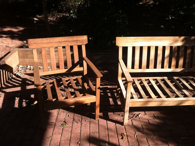
So my wooden furniture is on a shady but open air patio, not a covered porch.  And I never sealed or oiled the wood.  And here’s what it looked like.  The chair on the left has some definite mildew grunge.  The bench on the right has just had a good scrub with a bleach/water mixture and a stripping pad (like a sponge, but really hardcore).

20111010-184008.jpg

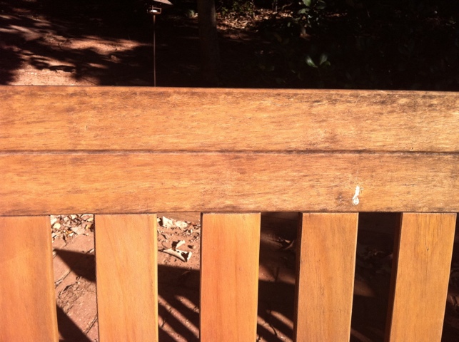
Here’s the closeup.  See how the slatted back still looks pretty nice, but the top is really grody with a pinch of birdpoo to complete the look.

20111010-184030.jpg

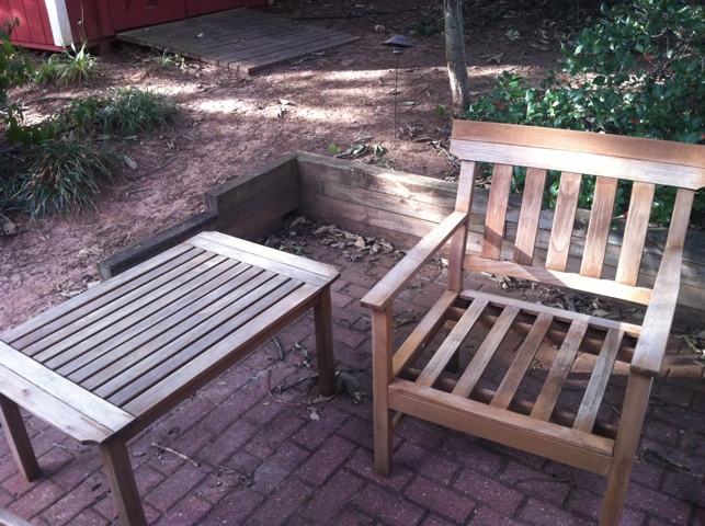
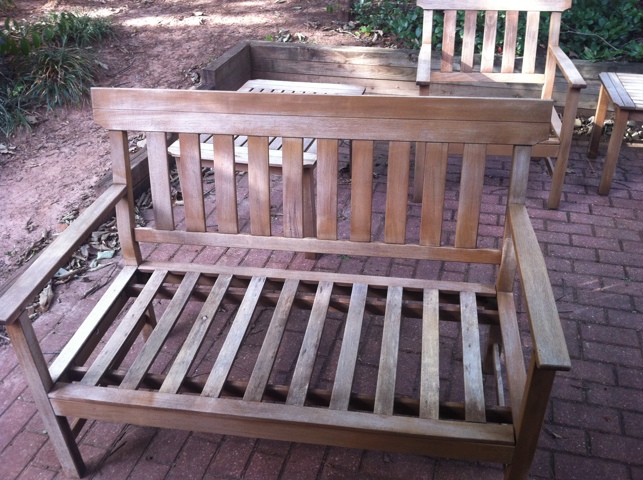
I sprayed everything off with the hose, but it was pretty obvious that it was more than just dirt.  The scrubbing not only took of the mildew, it also took off the original red stain.  But that was just fine with me, as it went along with my master plan to never maintenance these chairs again except for an occassional hosedown.  Here’s the furniture all naked and ready for a new look.

20111010-013115.jpg

20111010-013141.jpg

I figured to really protect the wood, it should be covered in something that is meant to protect wood that lives outside its entire life.  Not too long ago my dad stained his porch a nice tawny gray, and I thought hey that would work.  And sure enough he had almost a whole gallon of leftover stain that he gave me.

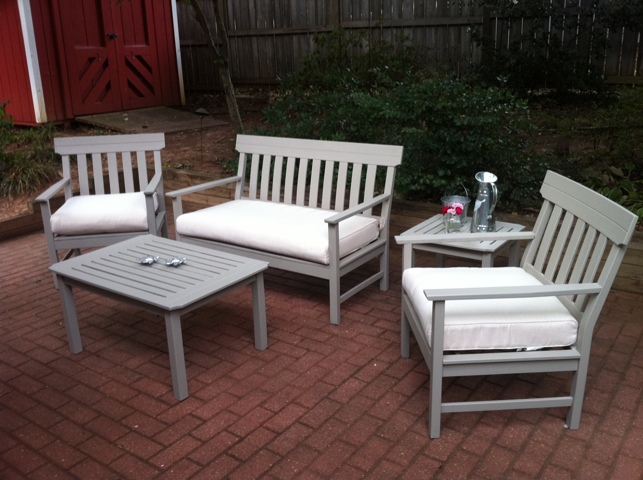
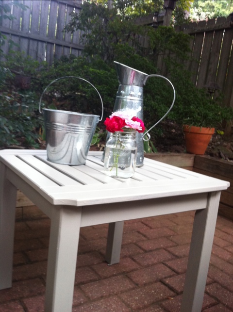
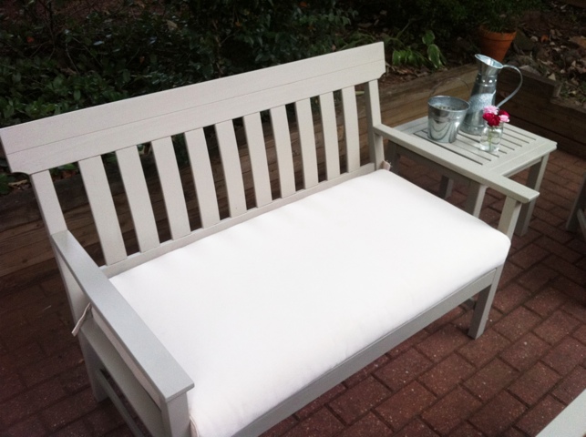
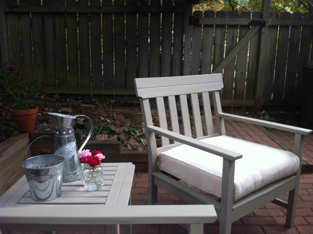
This lovely look is brought to you by Sherwin Williams Exterior Deck Stain (flat acrylic) in Belvedere tan.

20111010-013210.jpg

Why hello Mr. Belvedere.

20111010-013306.jpg

Aren’t you looking so fresh and brand new.  And younger!

20111010-013326.jpg

It took about 2 coats to get a nice solid look, but this stuff dries fast.  As I worked my way around one piece I could put another coat on in spots where it needed it.  No long waits around for anything to dry before getting that second coat on – basically no wait at all as there were so many sides to paint on just one piece.  The gallon was supposed to cover a couple hundred square feet, but we went through about half of it just doing the furniture.  I was suprised.

20111010-013345.jpg

My fence looks so blah in comparison.  Chris was gracious to join me in the painting project and good thing.  After so many sunny days, we finally got some rain, and this stuff couldn’t get wet for 24 hours after painting.  I started Saturday and left it out overnight, and saw a few sticky speckles the next day like some water drops fell on the table.  They painted over just fine and once finished, we stuck our pristine new furniture in the garage to set since rain was finally heading our way.

Do I regret not oiling/sealing the wood in its original stain?  Not really.  Yes, scrubbing the furniture was an un-fun task that took a couple hours of my time.  But the reddish wood used to just blend in/fade away with the red brick patio.  And between the yellow house and red shed and red garage, some nice crisp gray is a refreshing change.  Plus we don’t have a generic World Market set anymore.  Now its Mr. Belvedere.  Classy.

I’m going to Google Mr. Belvedere now, because I really have no idea who that is supposed to be.

Postcard Art

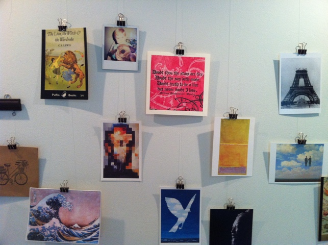
I like collecting postcards. They’re a cheap way to collect a lot of art prints in a very manageable size. Here’s a little DIY project we did to display postcards, photos, etc.

20111008-001020.jpg

Materials: 10 feet of trim, acrylic paint, eye screws, screw hole hangers, fishing line, binder clips.

We cut the trim into 3 sections, 2 of which were 2 feet and one 3 feet. We painted the trim black and attached the hangers to the back so we could hang the trim off of nails in the wall, just like a picture frame. Then Chris used his man hands to screw the eye screws into the bottom of the trim. We tied the fishing line to the loops and then tied on the binder clips. We did this after we hung up the trim so we could space out the clips and put several on one line and maintain a staggered effect.

20111008-001251.jpg

20111008-001314.jpg

20111008-001329.jpg

20111010-010357.jpg

We pick up postcards when we travel and/or go to museums, so I’ve got a decent set to rotate through and add to.

First Post! the To Do list

First post! We’re having a couple shindigs the 3rd week of October and I’m feeling the pressure using the motivation to get some stuff done around here. And actually I’ve shortened my list considerably considering one of these events is a Halloween party and I gots some crafting to do for decorations.

– paint living room
– hide tv cords in wall
– hang ikea shelves
– clean and stain wooden furniture
– get kitchen island
– paint kitchen stools
– clear back corner of yard (without falling in the well)
– string lights on the patio
– hang more stuff on the walls!
– make Halloween costume!
– DIY fabric banner for party

Wasn’t planning to paint the living room. We spackled the nail holes in the walls, so now we’ve got big white patches to cover up. No going back now!

The outdoor furniture has been needing some help for a while, and who wants to sit on mildewy furniture?

Well, enough computer time, let’s see how much stuff I can get done. =)